Enhancing your pieces – going the extra mile
When you first start out coloring, you keep it simple, and don’t go any further than coloring each piece. That’s what I did. But along the way, I started to notice that some artists’ work literally jumped off the page, and I began to wonder why. It’s the small enhancements that they’ve taken time to add, and, yes, it does take time, sometimes a lot of time, to do it, but the effort pays enormous dividends.
On this page, I’m taking an absolutely stunning image from an extraordinary Pigment artist, Dekibra, and showing you the different stages of coloring, along with giving you an quick explanation of what has been done.
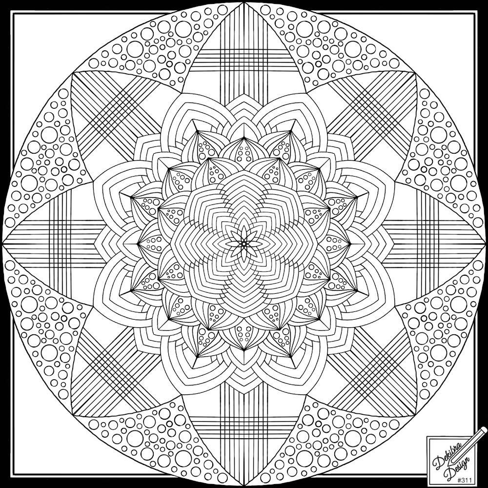
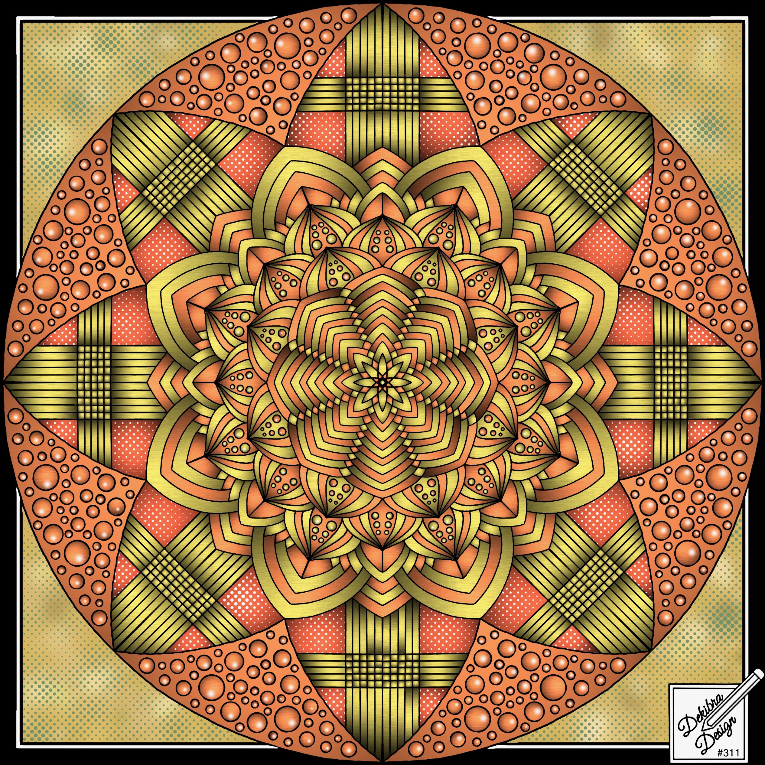
Dekibra’s original design
Colored, but with no enhancements
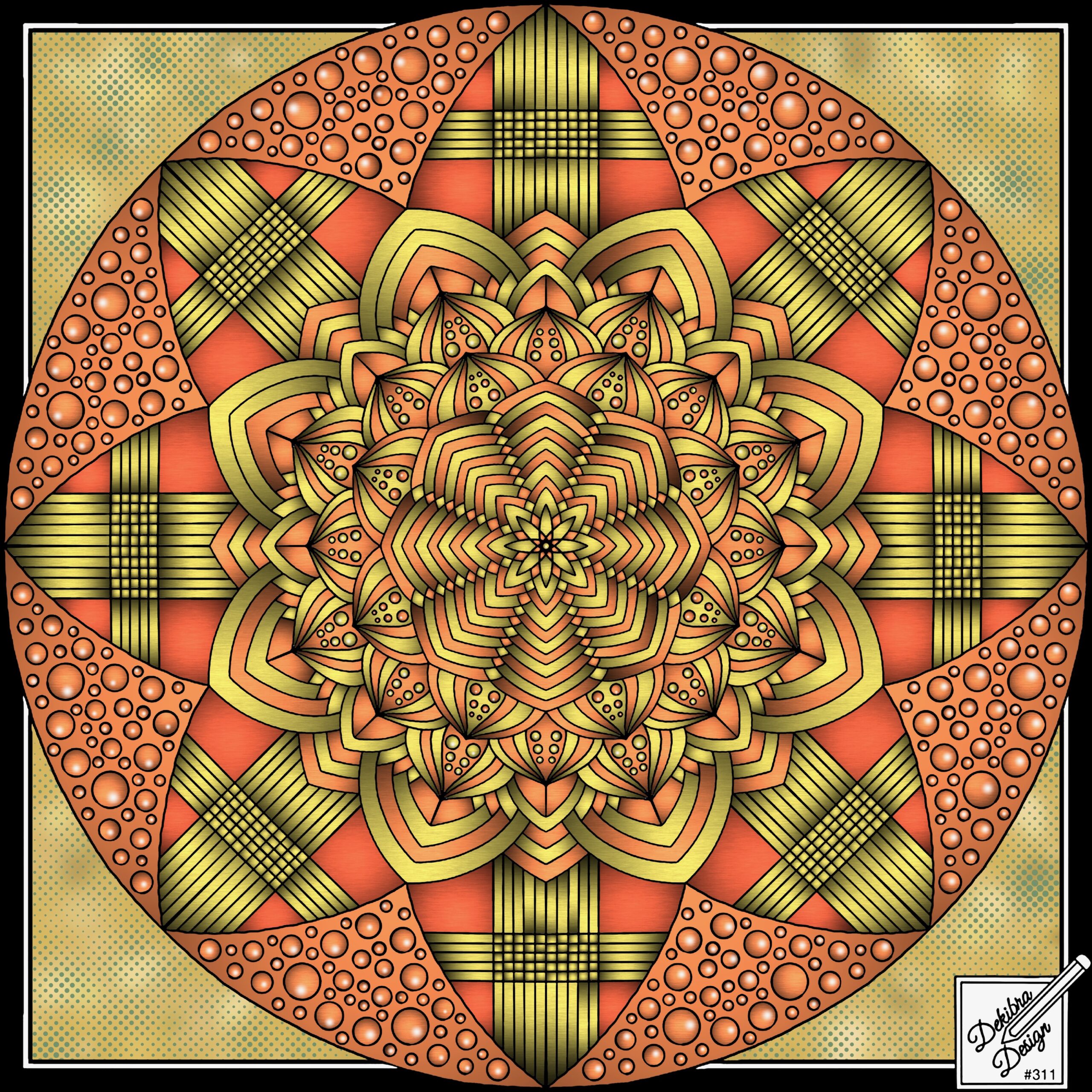
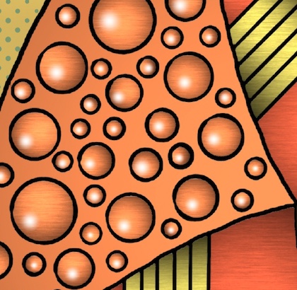
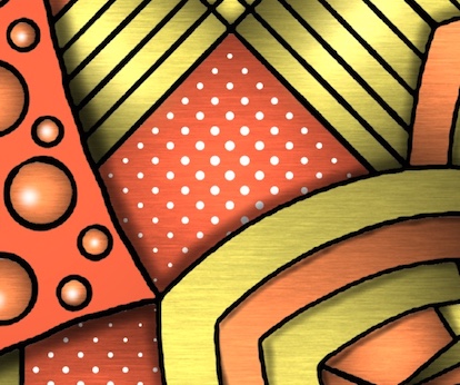
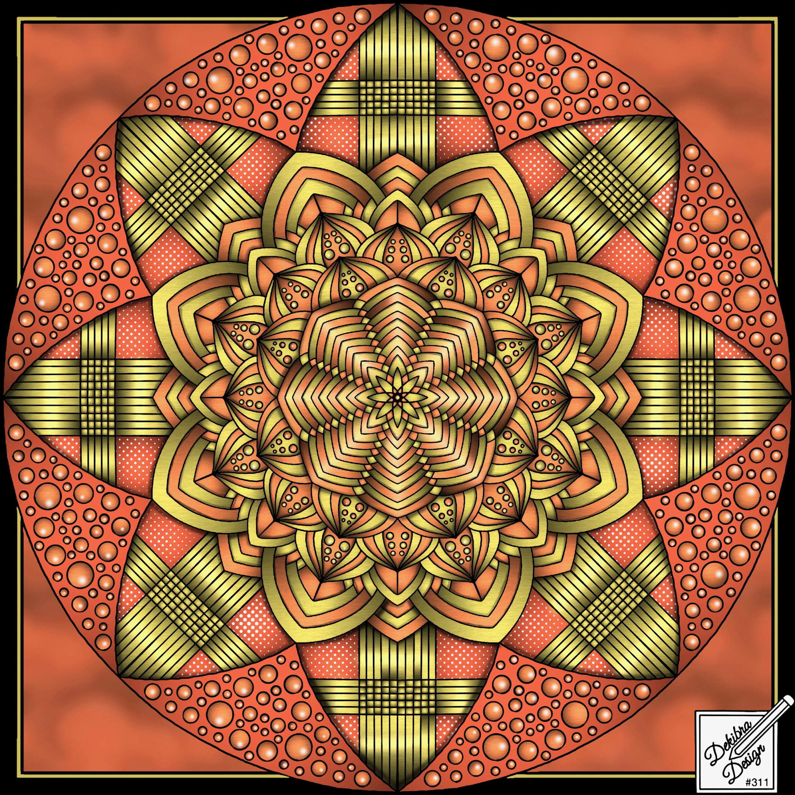
Here I’ve used the Bloom brush, and the color white, to add a small light flare to every single circular object, turning almost flat objects into spheres. (For the very small circles, I zoom in almost as large as I can go).
I’ve used the Halftone brush to add a white dot pattern to some of the inside border elements. You’ll also notice I’ve used it on the background corners. This brush is very versatile, and you can create some interesting effects with it, by varying the size of the brush, the opacity, and also by the amount of pressure you use. Most of the time, I’m just tapping very lightly, almost flicking the area I’m working on.
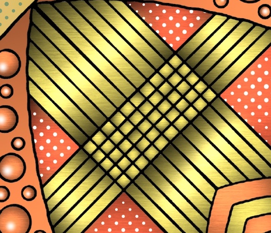
Using the Metallic Touch-Up brush, I’ve selected the gold color, and then lightened it by about 20%. Then I’ve changed to Freehand mode, with about an 8% brush size, and dragged through the center of each of the gold areas, creating a ‘cylindrical’ effect.
And, now there is just one more effect to add, but it is, in my opinion, perhaps the most dramatic of all; shadows. This is done, by me, at least, using the Airbrush, with a fairly small brush size, and around 30% opacity. I vary the brush size, and the pressure, depending on where I am applying shadows to. I’m also very systematic starting with the outside, going all the way around, and then moving to the next layer in.
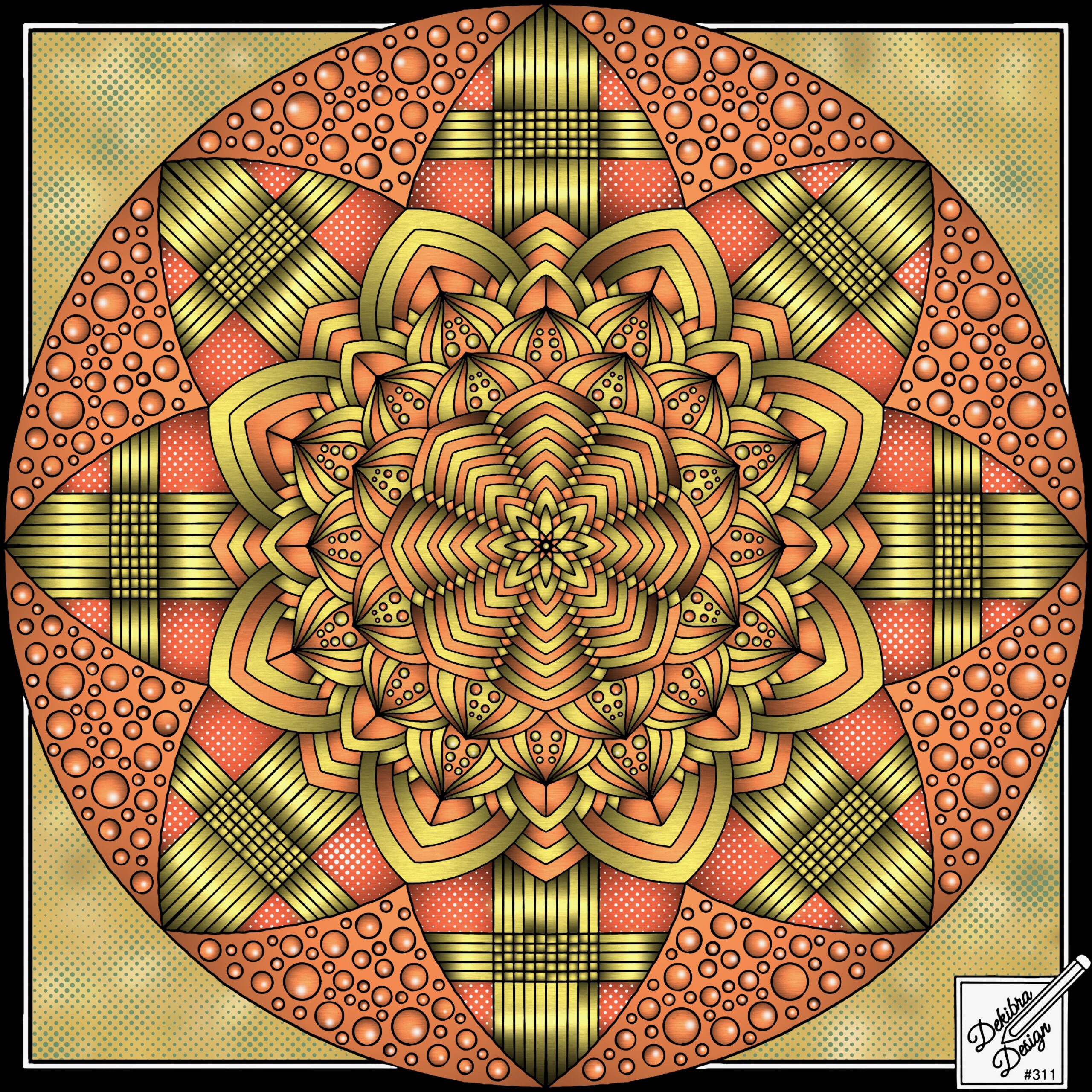
As well as adding shadows throughout, I’ve darkened some elements, and changed the background to use the Pencil Sea texture, which I’ve then blurred, plus I’ve colored the inner border. I’ve also used the Metallic Touch-Up brush to add a line straight through the center of each of the innermost elements, so they almost look like folded steel. Below you can see the Before and After versions.
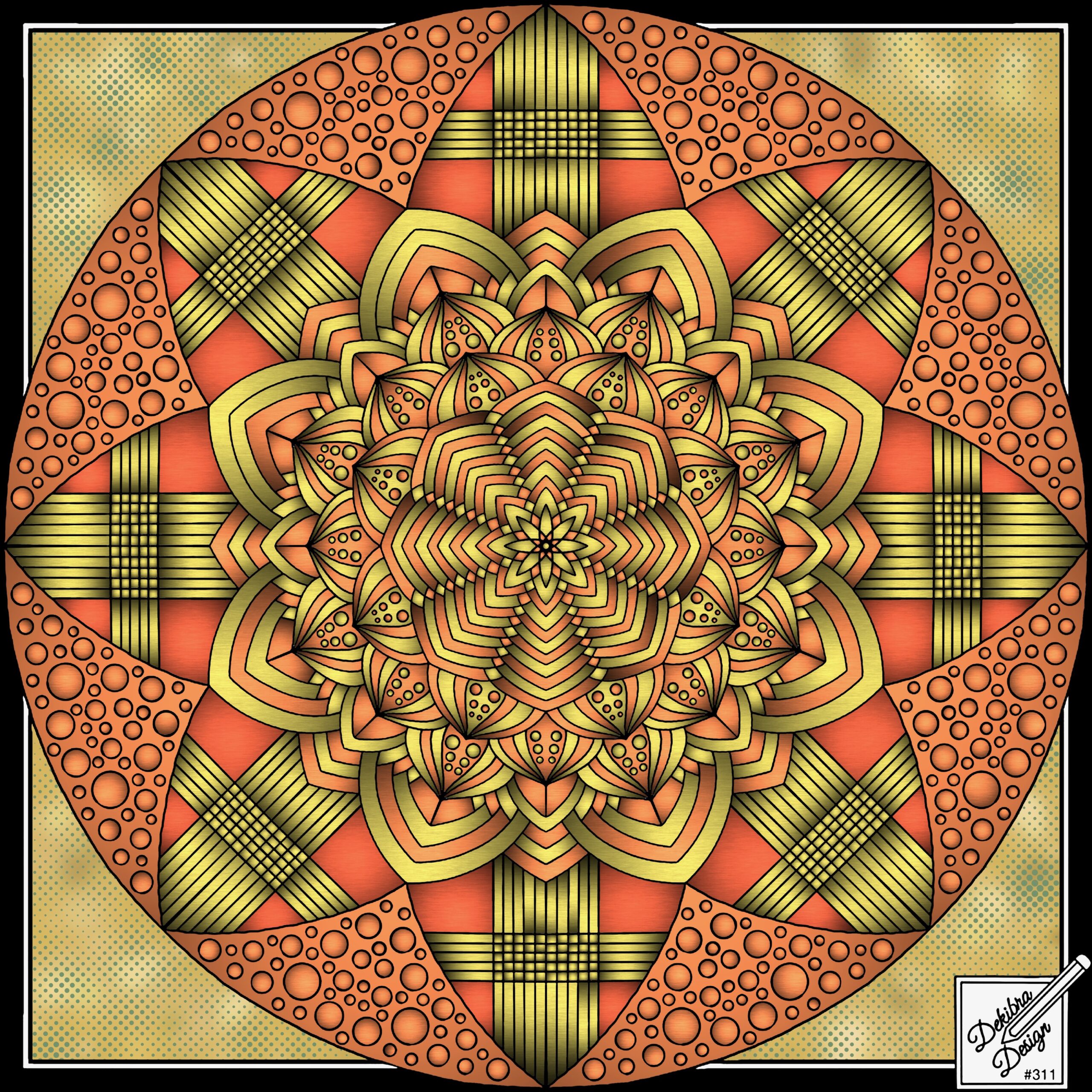
I hope you’ve found this blog article interesting, and it has encouraged you to ‘step outside the box’, and start enhancing your pieces. It does take time, but, above all, it takes practice, and a lot of use of the Undo button. Happy coloring. Michael Rocharde.

